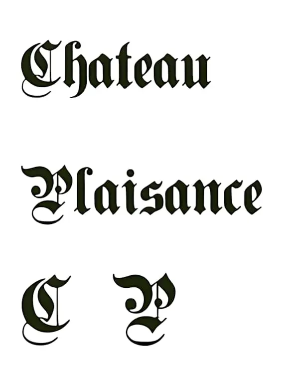
The new Plaisance logo has been the subject of several inquires, so I thought I would break it down for you. When you type out Chateau Plaisance using the font "Plain Germanica" it will look like this:

When the "C" and the "P" are placed together, the center of the logo is now no longer a mystery. This is the logo in metal on side of the existing barrel cellar.
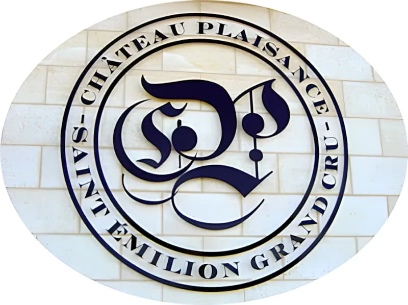
For me, the logo strikes me as musical.
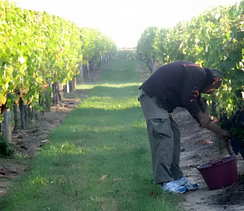
I thought I would update you on the growth of the vines in the fields. This is the same vine photographed in the last blog.
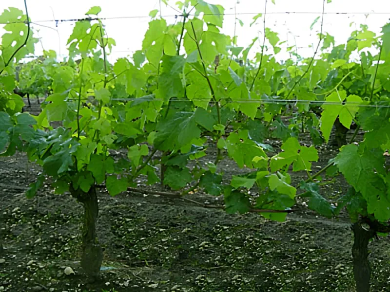
It has filled out well in the past 12 days.
If only we could develop and flourish as quickly.